
Let your data visualization tell the real story.
The Impact of Visualization: More Than Just Pretty Charts

It's great to have you here! I am Stephen Wen, a data analyst and data engineer.
I began writing on Medium since 2022. I decided to publish "Stephen Data Visualization" to share valuable content related-to data visualization, and this is the very first article in this newsletter. I aim to introduce the basics of data visualization. I hope you find it helpful!
Let’s start it!
Data visualization is not only for the data analyzer, in most cases, it is used to share insights with the users in every professional industry.
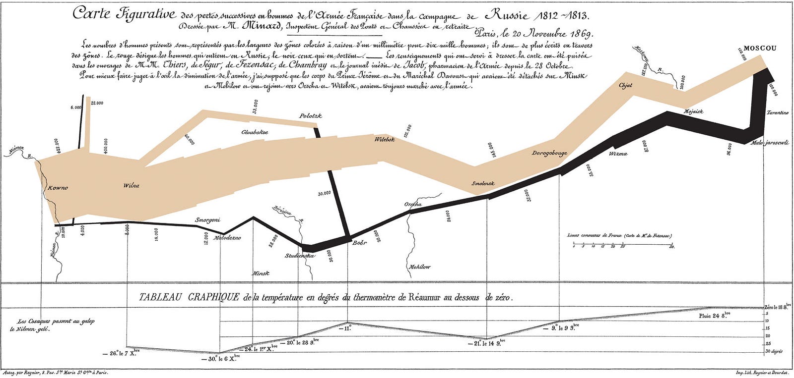
This technology has always been one of the best tools for conveying important matters. As early as 1869, the famous graphic by Charles Joseph Minard depicting Napoleonic France’s invasion of Russia perfectly presented the war situation between France and Russia on a single sheet of paper.
Back in our era, data visualization has become a widespread skill.
However, the visualization you are revealing might not always be an accurate representation.
Let’s dive into the core question: Why do we need to visualize the data?
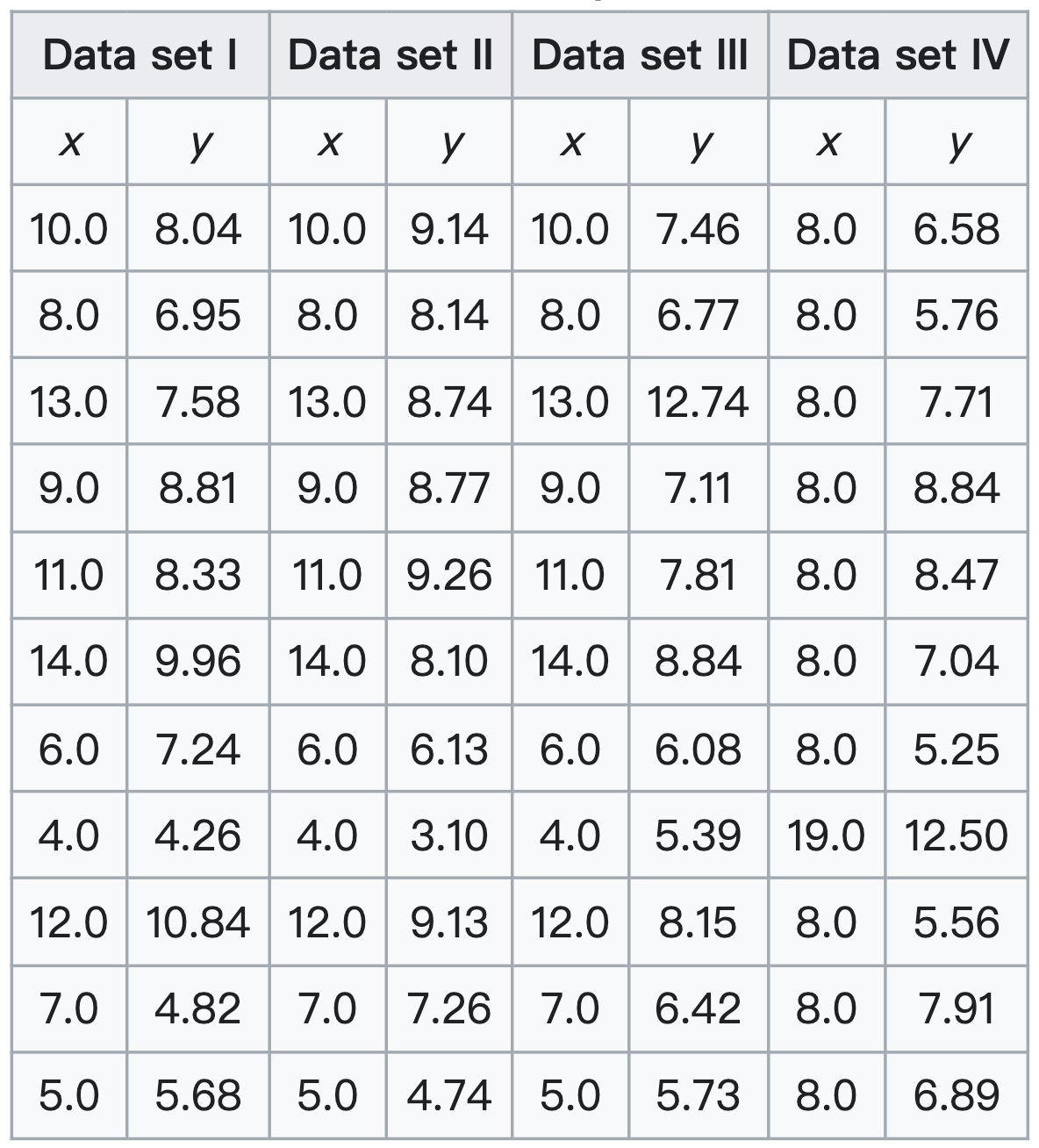
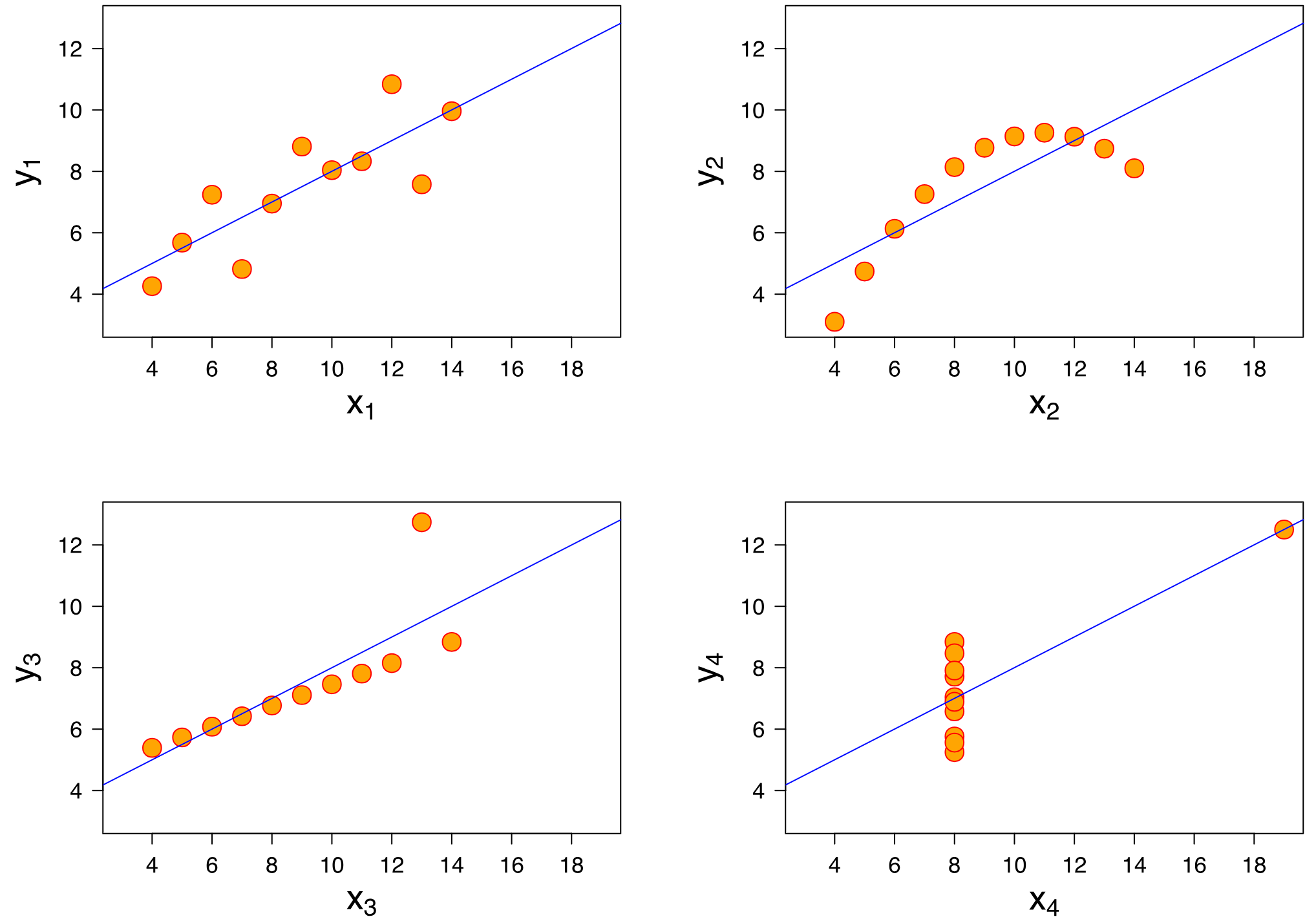
Human beings are visual animals, we are not good at directly digesting the patterns in a table. The following graph allows us to easily understand this concept. These data sets are originally from Anscombe’s quartet in 1973.
Thus, the major purpose of data visualization is to clearly show the hidden patterns that are not obvious to the naked eye by just looking at Table 1.
Now, unless your purpose is to mislead your audience, you wouldn’t want to make the mistake in the chart below.
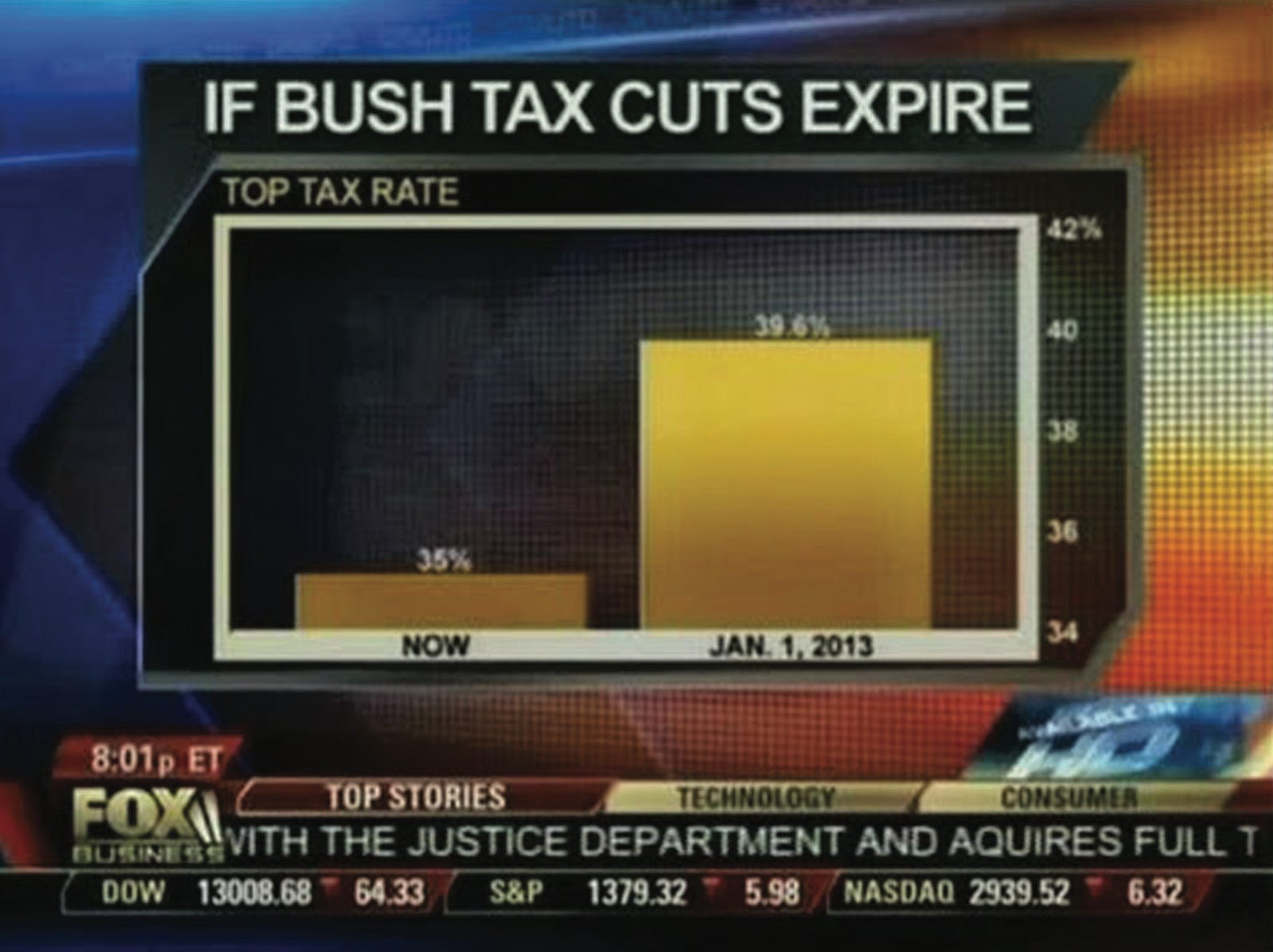
This is a simple bar chart. At first glance, there doesn’t seem to be any problem here; the chart simply illustrates the change between two years, with one year at 39.6% and the other at 35%, indicating a difference of 4.6 percentage points. You may ask yourself why the bars look so different when there’s only a 4.6% gap between them.
This is the power of data visualization and how easily it can manipulate an audience: we can imagine a scenario, in a prime-time news broadcast, and the quick display of the graph leads us to believe there is a huge difference in data between the bar on the left and the one on the right.
So, the whole picture is actually like this, Graph 3:
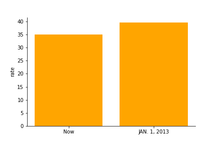
Merely adjusting the intervals of the Y-axis can completely transform a viewer’s interpretation of a data chart! This, to some extent, is a subtle art of misleading the viewer without their awareness — a technique you might also observe in election polling.
An ideal data chart must at least aim to be clear and not misleading. So, when making a chart, pay close attention to the axes and scales. This is key to ensuring accuracy and clarity.
Furthermore, makes it easy for others to understand. For instance:
Data trends related to time are best represented using line charts.
Data that is categorical and not tied to time scales is more appropriate with bar charts.
These choices are based on human intuition. We see connected points as a series and regard separate bars as distinct categories.
Let’s take an example!
I’ve recently performed a visualization of my email box across these years, revealing an annual analysis of received emails. It’s possible to discern patterns within these plots, offering trend information.
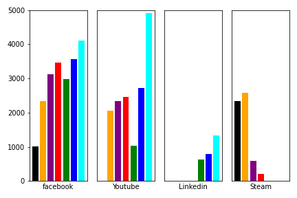
Graph 4 compares the annual mail volume across various categories, with each bar representing a category and different years distinguished by color. This is a very common method of presenting data in charts, I bet most of you’ve seen this kind of visualization before.
However, it’s a bad way to visualize this data set.
Why? You will notice that in this cross-category, cross-temporal bar chart, it is challenging to identify at a glance which categories are experiencing an increase or decrease in specific years. To extract such information from this chart, we are left with no choice but to manually leap and compare with our own eyes across the graph! (Indeed, comparing the multi-year data trends of more than three categories simultaneously is virtually impossible, unless one resorts to using pen and paper!)
This comparison process is not only tough but also prone to errors. A single mistake in the year can completely alter the viewer’s perception of the data as a whole. Imagine a scenario. You’re on stage presenting annual revenues for clients. You wouldn't want the audience to go through such a process.
As a comparison to Graph 4, I have created a chart depicting my recommended improvements: Graph 5.
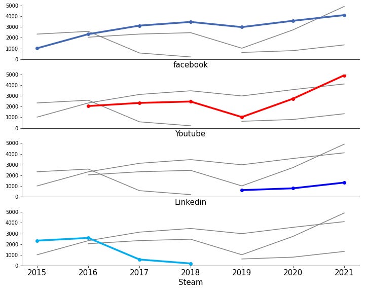
In Graph 5, we have kept the trend from Graph 4. Each subplot has data from a different category. The grey lines give a background for other categories. They let viewers compare data by year and category. Also, the X-axis only needs to be at the bottom chart because we are good at comparing things vertically. To make the visualization even better, we could dim the background grey lines even more and annotate specific numbers on key data points (in this case, fade or delete the y-axis at the same time.).
You'll find that making this comparison in Graph 4 is a particularly challenging task.
Why? let’s conduct a simple summary. In the improved charts, I use three methods to reduce the ‘cognitive load’ on viewers:
Opting for monochromatic shades instead of multicolored ones.
Enhancing viewer focus through the use of multiple subplots.
Replacing the X-axis with a timeline.
On the first point, readers might think that color makes clear the differences between data categories. In principle, this is true. However, you’ll find that an excess of colors can lead to visual fatigue. Using similar shades in the same color temperature (warm or cool) can do the same while being gentler on your eyes. In many cases, just two colors are enough (as shown in Graph 5).
Let's move to the second point, which is to use many subplots, this will focus viewers' attention on one piece of data at a time. This approach enables a clear observation of annual trends. Also, the X-axis is aligned. So, it's very easy to compare data categories across charts.
In the third point, the reason for putting time on the X-axis is simple. Humans are used to seeing charts with time on the X-axis. You can try swapping the axes of any chart and see for yourself.
In short, analyzing personal emails is different. It's unlike the revenue analysis at a company’s annual meeting, so it doesn't need such a "serious" approach to information presentation. But, accurately showing key information in charts is a crucial skill. This is true in an era where data tools are more and more common. Especially in some important situations, data charts are easy to understand, they play a vital role in driving change in organizations and society!
This is the end, if you have any suggestions or comments, feel free to leave a message or contact me.
Thanks for reading.
-Stephen Wen

I'd really appreciate your help in enhancing this publication, let me know every feedback through comment, Linkedin or email!